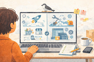
What to Put on Your Homepage : For Beginners de
A homepage should make the next step obvious
A lot of small online stores ask too much from the homepage. It tries to be a brand story, a product catalog, a sales page, and a help center all at once. When that happens, shoppers land, scan for a few seconds, and still do not know what the store sells or where to click.
A better homepage is simpler. It should help a first-time visitor understand what you sell, why your store feels trustworthy, and what to do next. That alone can move someone from curiosity to browsing.
For a small ecommerce business, clarity usually beats clever wording. A clean headline, a short path to products, and a few trust-building details can do more than flashy banners or crowded design. If your homepage feels calm and easy to scan, you are already ahead of a lot of stores.
What your homepage needs to do first
Before choosing sections, buttons, or images, it helps to know the page’s real job. For most small online stores, the homepage should explain the offer, guide people toward products, and reduce hesitation. It does not need to answer every question at once.
Think about a first-time visitor who has never heard of your brand. They land on the page and start asking silent questions right away. What do you sell? Is this for me? Can I trust this store? Where do I go next? Your homepage should answer those questions quickly, without making people work for it.
The first screen matters most. A shopper should be able to understand the basics in a few seconds. That usually means a clear headline, one short supporting sentence, one obvious button, and a visual that supports the product instead of distracting from it.
A vague headline is one of the easiest ways to lose people. “Designed for everyday living” may sound polished, but it does not tell anyone what you sell. “Minimal kitchen storage for small apartments” is clearer. “Organic dog treats for sensitive stomachs” is clearer too. Specific beats pretty when someone is deciding whether to stay.
What should be visible near the top
- A headline that says what the store sells
- A short line that adds context or benefit
- One main call to action, like “Shop Best Sellers”
- Simple navigation to key categories
- A clean image or illustration that matches the product
If those basics are missing, the rest of the homepage has to work harder than it should.
The homepage sections that matter most
Most small stores do not need a long homepage with ten different blocks. Five to seven useful sections is usually enough. The goal is not to say everything. The goal is to guide the next step.
Start with a hero section. This is the top area of the homepage, and it should answer the main question fast. Say what you sell, who it is for, or what makes the offer easier to understand. Then add one button that points shoppers somewhere useful.
After that, include category or collection shortcuts. This matters because many visitors are not ready to buy one exact item yet. They want a simple way to browse. A candle shop might show Fresh Scents, Gift Sets, and Best Sellers. A clothing store might show New Arrivals, Tops, Bottoms, and Sale.
Next, feature a small group of products or one strong collection. Keep this focused. Four to eight items is plenty for a homepage section. If you try to show too much, the page starts feeling like a cluttered category page.
A trust section helps new shoppers feel more comfortable staying on the site. This does not need to be dramatic. Plain language works better. A short block that says ships in 2 business days, easy returns within 30 days, secure checkout, and email support from a real person can do a lot of quiet work.
A review or testimonial section can help too, even if you only have a handful of reviews. Keep it short and readable. One or two real comments is enough to reassure people that others have bought from you and had a good experience.
A brief About section works well near the middle or lower part of the page. This is not the place for your full founder story. Two or three lines is enough. Explain what the store makes, why it exists, or what standard you care about. A simple line like “We started this store to make sturdy travel pouches that do not waste space” gives the brand a human feel without slowing the page down.
Finally, the footer should do quiet but important work. Include links to contact information, shipping, returns, FAQs, and policies. A footer does not sell on its own, but it helps the whole site feel complete and trustworthy.
Common homepage mistakes that confuse shoppers
A lot of homepage problems come from trying to do too much. More sections do not always make the page stronger. Sometimes they just add noise.
One common mistake is stacking too many announcements at the top. A promo bar, free shipping banner, popup, discount message, and rotating slider can turn the first visit into a wall of interruptions. For a small store, one clear message usually works better than five competing ones.
Another issue is weak navigation. If the menu is crowded with too many links, shoppers have to stop and think. That pause creates friction. A clean menu with a few useful categories is easier to trust and easier to use.
Some stores also hide practical details too far down the page. Shipping, returns, support, and delivery timing should not feel buried. People do not always need the full policy right away, but they want reassurance that these basics exist.
There is also the problem of homepage copy that sounds nice but says little. “Thoughtfully curated essentials for modern life” could describe almost anything. It does not help someone decide whether the store is relevant. Clear copy may feel less fancy, but it usually performs better because it respects the shopper’s time.
One more mistake is making the homepage look like a category page, a blog archive, and an About page all at once. The homepage should point people somewhere useful. It should not dump everything on the screen and hope they figure it out.
A quick homepage checklist before you publish
Before you publish your homepage, review it like a new visitor instead of the store owner. Open it on desktop and mobile. Then ask a few simple questions: What does this store sell? What should I click first? Do I trust this store enough to keep browsing?
Quick checklist
- [ ] The headline clearly says what the store sells
- [ ] The main call to action is easy to find
- [ ] The menu is short and easy to scan
- [ ] Categories or collections are visible
- [ ] Featured products are focused, not overloaded
- [ ] Shipping, returns, or support basics are easy to spot
- [ ] At least one trust signal appears on the page
- [ ] Images feel consistent in style and size
- [ ] The page looks clean on mobile
- [ ] The footer includes contact and policy links
A useful test is the five-second scan. Show the homepage to someone who has never seen your store before. Let them look for five seconds, then ask what they think the business sells and where they would click next. If they struggle to answer, your homepage probably needs clearer copy or better visual hierarchy.
Keep it simple, then improve from there
A good homepage does not need to be perfect on day one. It needs to be understandable. That is the real first win.
Start with the basics: a clear headline, clear categories, a focused product section, and a few trust signals. Then watch what shoppers do. If one category gets clicked more than the others, move it higher. If customers keep asking the same shipping question, add a short reassurance block on the homepage. Small changes based on real behavior usually beat a full redesign based on guesswork.
For small ecommerce brands, the homepage works best when it feels calm. Not empty, not bland, just clear. A shopper should land, understand the offer, and know what to do next without feeling pushed or confused.
If your homepage feels messy right now, do not start by redesigning the whole thing. Start by trimming it. Rewrite the top headline so it clearly says what you sell, simplify the main menu, and keep only the sections that help a new shopper trust your store and start browsing.
Once that is in place, check the page on your phone and make sure it still feels easy to scan. A simple homepage that makes sense will usually do more for a small store than a fancy one that tries to say everything.
FAQs
Q1. Does every online store need a homepage?
A1. Yes, in most cases. Even if shoppers land directly on product pages from ads or search, the homepage still helps people check whether the store feels legitimate and easy to navigate.
Q2. What is the most important thing on a homepage?
A2. Clarity. A shopper should be able to tell what you sell and what to do next within a few seconds.
Q3. Should I put all my products on the homepage?
A3. No. A homepage should highlight a focused set of products, categories, or collections. Too many items can make the page feel crowded.