Homepage Copy for Ecommerce: 5 Sections to Include : For Beginners de
Why homepage copy matters more than it looks
A lot of small store owners think of the homepage as a design project first. They focus on banners, colors, product tiles, and photos, then drop in a few lines of copy wherever there is room. The problem is that the words on the homepage often decide whether a new visitor understands the store in the first few seconds.
That is a big job. A first-time shopper is trying to figure out what the store sells, whether it feels trustworthy, and where to click next. If the copy is vague, overloaded, or too brand-heavy, the page can still look polished and leave people confused.
For a small online store, stronger homepage copy does not mean writing more. It usually means writing clearer copy in the right places. A simple structure helps the page explain the offer, reduce doubt, and move people toward browsing.
The 5 homepage copy sections to include
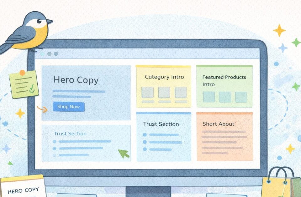
A homepage does not need to say everything at once. It needs to guide the visitor through the basics in a useful order. For many small stores, five copy sections are enough to do that well.
1) A clear hero headline and subhead
This is the first job. The top of the homepage should quickly say what the store sells and why someone should care.
A lot of stores lose clarity here by using brand-style lines that sound nice but do not explain the offer. “Thoughtful essentials for everyday living” could mean almost anything. A clearer version might be “Simple storage tools for small kitchens” or “Fragrance-light skincare for sensitive routines.”
The supporting line underneath should add just enough context. It can explain who the products are for, what kind of products the store offers, or what makes the approach practical.
A strong hero section usually includes:
- one headline that says what the store sells
- one short supporting line
- one clear call to action like “Shop Best Sellers” or “Browse New Arrivals”
This is not the place for a paragraph. Keep it sharp.
2) A quick category or collection intro
After the hero, many shoppers want an easy way to browse. This is where a category or collection section helps.
The copy here does not need to be long. Often the category names do most of the work, but a short intro line can help frame the section. For example: “Start with the collections our customers shop most.”
This part matters because not everyone lands ready to buy one exact product. Some people want a low-pressure path into the catalog. Good homepage copy gives them that path without making them dig through menus.
3) A short trust section
A homepage should also answer the quiet question: why should I trust this store enough to keep going?
This section can be very short. Three or four short trust lines are often enough:
- ships in 2 business days
- easy returns within 30 days
- secure checkout
- support from a real person
The wording should stay plain. Trust copy works best when it sounds direct, not dramatic. You are not trying to impress people. You are trying to reduce hesitation.
4) A featured products or best-sellers intro
If you are highlighting products on the homepage, the copy should help explain why those items are there. A short heading like “Best Sellers” or “A Good Place to Start” can work well. You can also add one line that gives context, such as “The products customers come back for most.”
This section works better when it feels curated. The homepage is not your whole catalog. It should help people move toward a useful next click. A little framing copy can make that section feel more intentional.
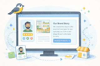
5) A short About or brand-intro block
This is where the homepage can add a human layer without making the visitor open another tab right away. A full About page is still useful, but a short homepage brand intro can help the store feel more real.
This section often works well with two or three lines about what the store is about and who it serves. For example: “We started this shop to make practical travel gear easier to choose. We focus on simple designs that hold up to regular use and pack without the bulk.”
That kind of copy does not need to be emotional or long. It just needs to make the brand feel grounded.
How to keep homepage copy clear and useful
Once the five sections are in place, the next step is making sure the writing stays easy to scan. This matters because most visitors do not read a homepage top to bottom. They skim first, then decide where to pay attention.
One simple rule helps a lot: write the homepage for a first-time visitor, not for someone who already knows the brand. That usually leads to more specific wording and fewer abstract lines.
It also helps to keep each section doing one job. The hero explains the offer. The categories help browsing. The trust section reduces hesitation. The featured section gives direction. The brand block adds context. When each section has a role, the page feels calmer.
Practical steps
- Rewrite vague lines so they say what the store actually sells.
- Keep section headings short and obvious.
- Use one main idea per section.
- Read the homepage out loud to catch awkward or fluffy wording.
- Check the page on mobile to make sure the copy still feels easy to scan.
A simple example makes the point. A weak homepage line might say, “Designed to elevate your daily routine.” A stronger one might say, “Simple desk tools for people who want less clutter and easier setup.” The second version gives the shopper something real to work with.
Common homepage copy mistakes to avoid
One common mistake is treating the homepage like a slogan wall. A lot of branded lines stacked together can make the page sound polished but unclear.
Another issue is writing too much in the hero section. The visitor does not need the full story at the top. They need a fast explanation of what the store sells and where to go next.
A third mistake is using the same kind of copy in every section. If every block says some version of “quality,” “care,” and “thoughtful design,” the page starts to blur together. The sections should each move the shopper forward in a different way.
Common mistakes
- vague headline copy
- too much text in the first screen
- no trust copy anywhere on the homepage
- featured sections with no framing or reason
- a brand intro that says very little about the actual store
- copy that sounds polished but not useful
There is also the issue of forgetting the next step. Good homepage copy does not just describe the brand. It helps people know what to click.
A simple example: imagine a small gift store with a homepage that says, “Objects for meaningful moments.” That may fit the brand voice, but it does not help much on its own. A clearer version might say, “Simple gift sets for birthdays, thank-yous, and everyday celebrations.” That version gives the shopper more direction right away.
A quick homepage copy checklist summary
Quick checklist
- [ ] The hero headline clearly says what the store sells
- [ ] The subhead adds useful context without rambling
- [ ] Category or collection sections help people browse quickly
- [ ] The homepage includes short trust-building copy
- [ ] Featured products have a short intro or framing line
- [ ] The brand intro says who the store is for and why it exists
- [ ] Each section has one clear job
- [ ] The copy is easy to scan on mobile
- [ ] The wording sounds natural, not overly branded
- [ ] The page helps people know what to click next
If several of these basics are missing, the homepage may still look good while making the store harder to understand.
Keep the message simple, then improve from there
A homepage does not need more copy to work better. It usually needs better-placed copy. That is the difference.
For a small online store, the smartest first move is often to tighten the sections that matter most. Start with the hero. Then make browsing easier. Add a short trust block. Frame your featured products. Finish with a grounded brand intro.
That structure is usually enough to make the homepage feel clearer and more trustworthy without turning it into a long sales page.
Gentle next step
Open your homepage and look only at the section headings and first lines. If a brand-new visitor could not tell what you sell and where to go next from those alone, tighten the copy before redesigning anything else. Sin estres. Better wording often improves the page faster than another layout tweak.
FAQs
Q1. How much copy should go on an ecommerce homepage?
A1. Enough to explain the store clearly and guide the next step, but not so much that the page becomes hard to scan. Many small stores do well with a few focused sections instead of long paragraphs.
Q2. What is the most important homepage section?
A2. The hero section usually matters most because it is the first thing many visitors see. It should quickly explain what the store sells and where to click next.
Q3. Does every homepage need a brand story section?
A3. A short brand-intro block often helps, especially for newer stores, but it does not need to be long. A few clear lines can be enough to add trust.
Q4. Should trust copy go on the homepage even if I have separate policy pages?
A4. Yes. A short trust section on the homepage can reduce hesitation early, while the full policy pages handle the deeper details.